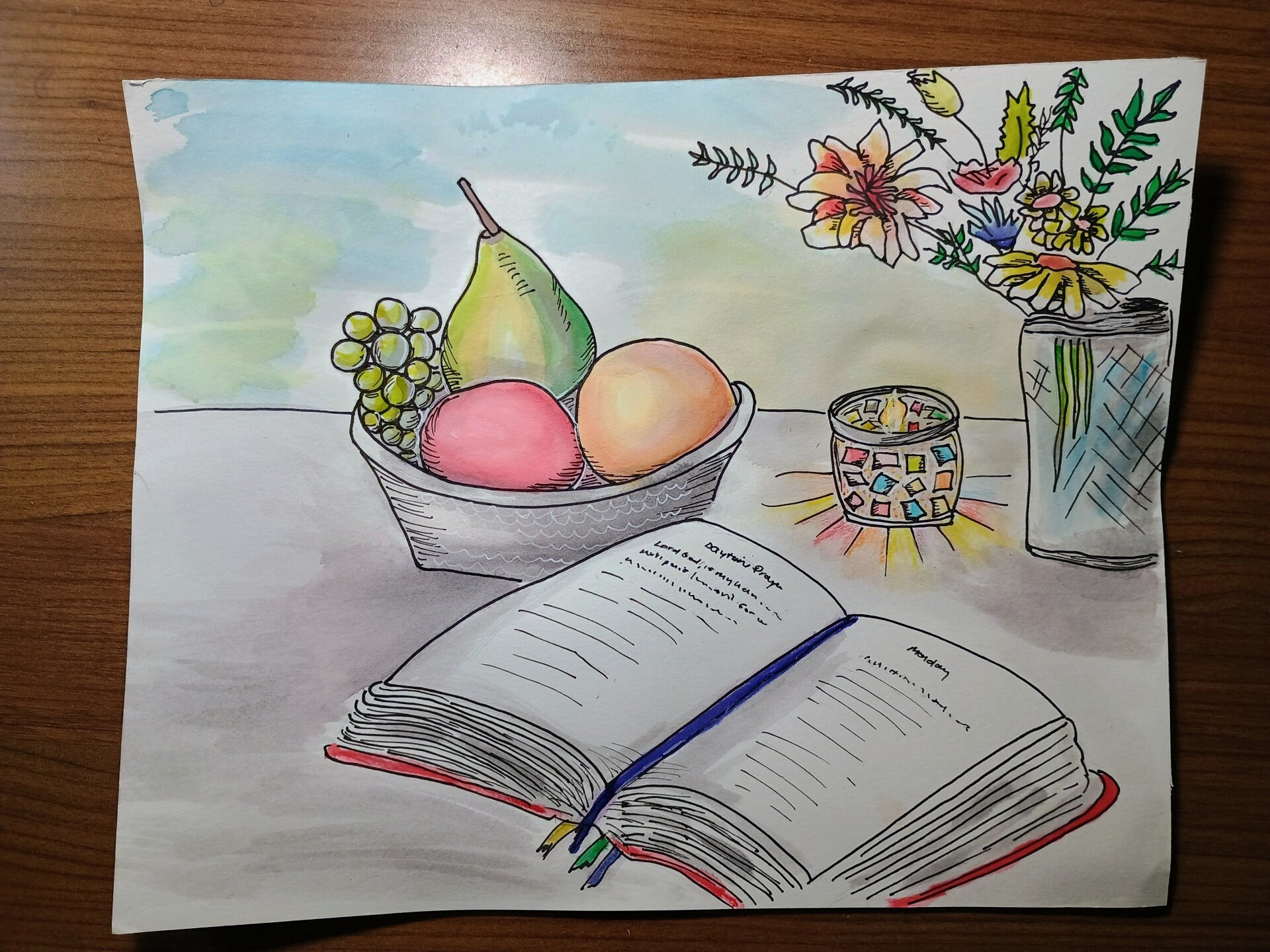
Continuing the Ink & Wash story, these illustrations highlight bold ink lines enhanced with subtle pops of color, blending tradition with a modern touch.

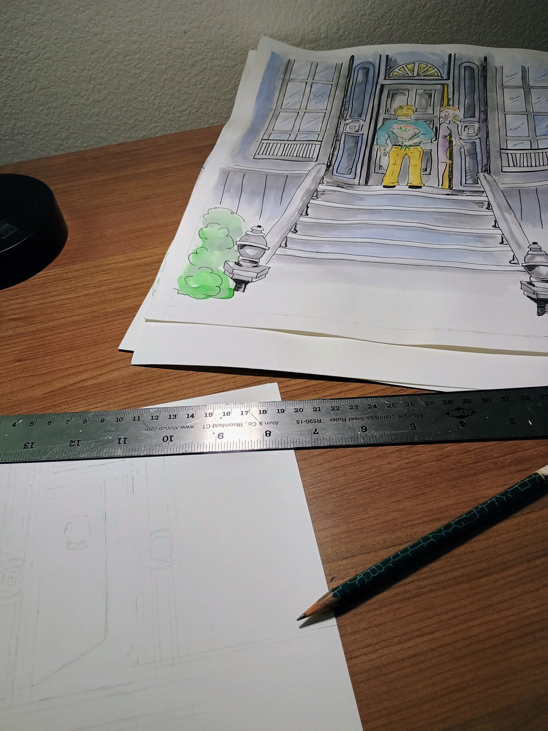
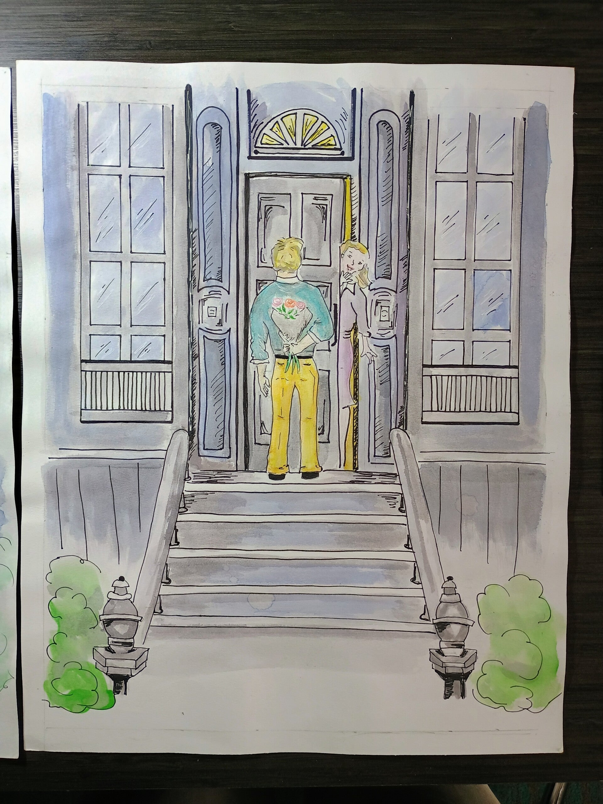
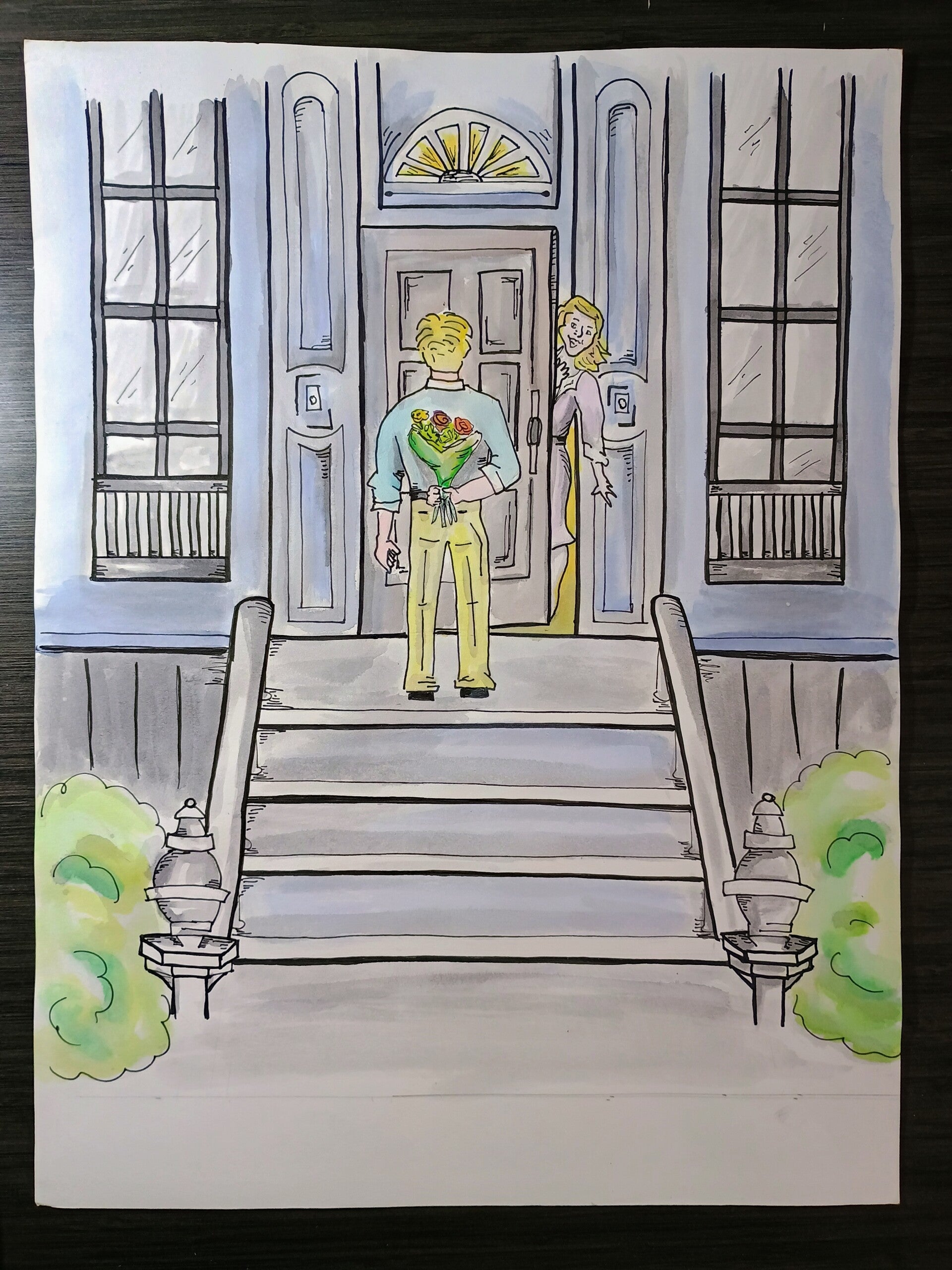
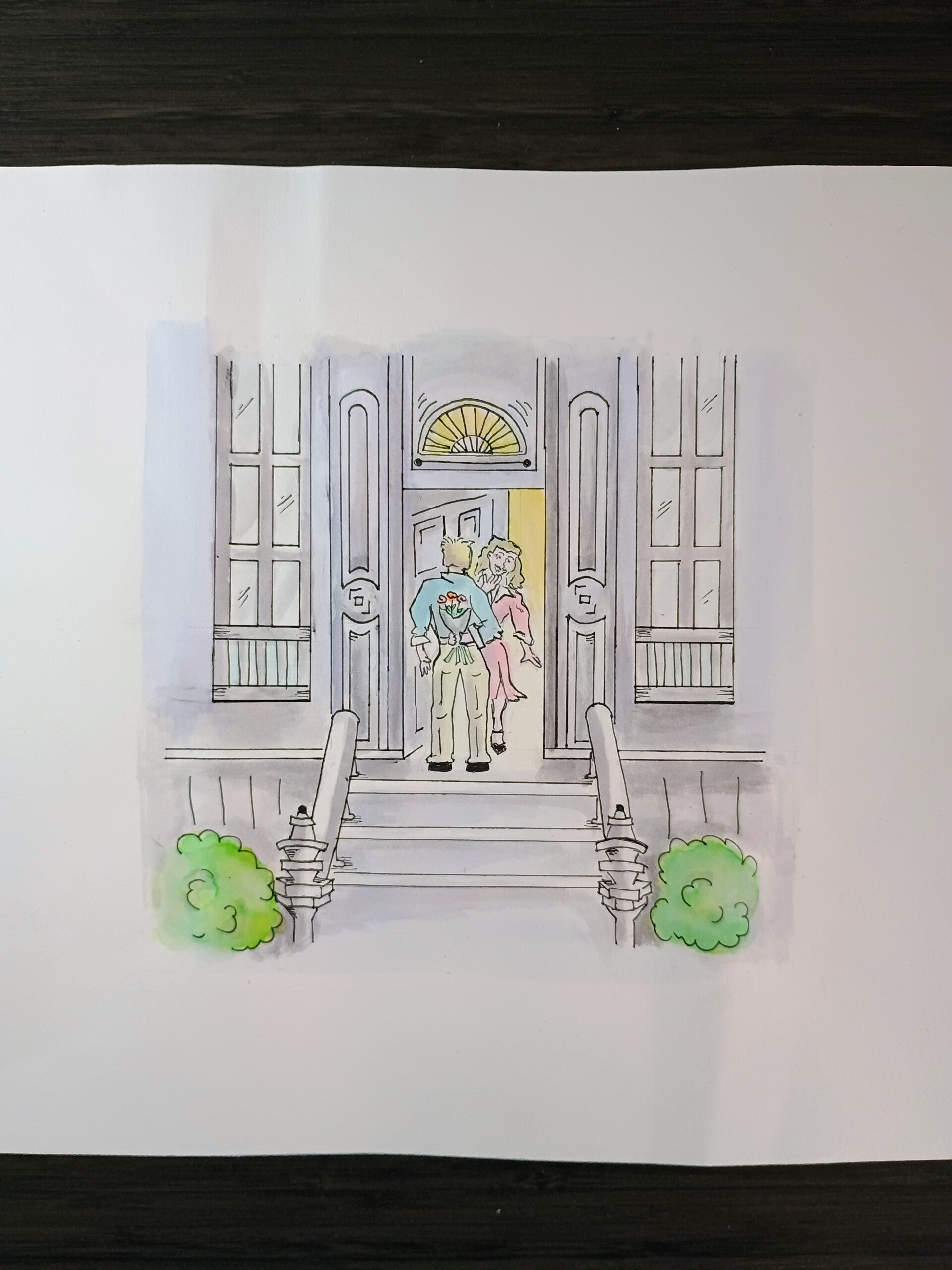
Last month, we explored the history of ink from Japan and introduced the Ink & Wash technique using India ink, showing how it can be layered to create depth and tone before adding color. This month, the technique is applied to a narrative scene. The illustration depicts a traditional date, inspired by the staircase from the movie Hitch, though the scene itself is entirely original: a man holding a surprise bouquet of flowers behind his back, while a woman stands in the doorway.
The Process
The illustration began with an ink pen outline, followed by shadowed areas painted with India ink, allowing each layer to dry before deepening shadows. Watercolor was then added to provide soft vibrancy. Achieving a straight and balanced perspective for the doorway and stairs required careful measurement, and short vertical marks were added in shadowed areas to create dimension.
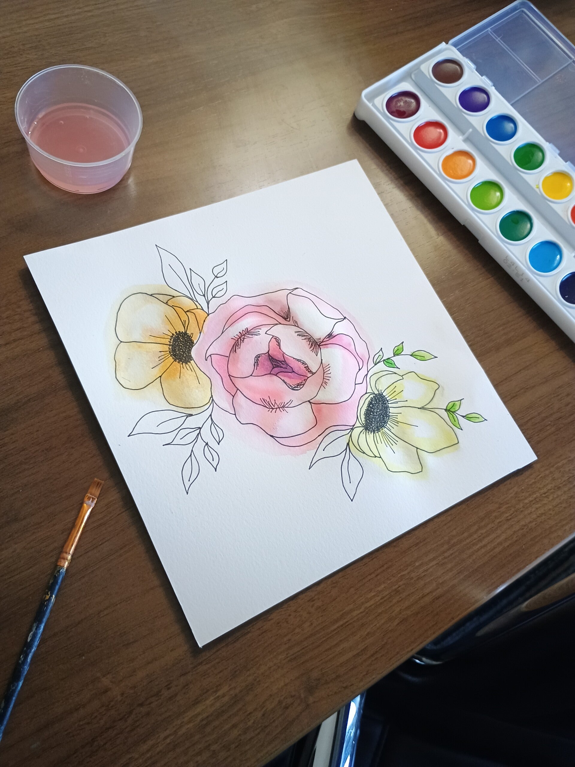
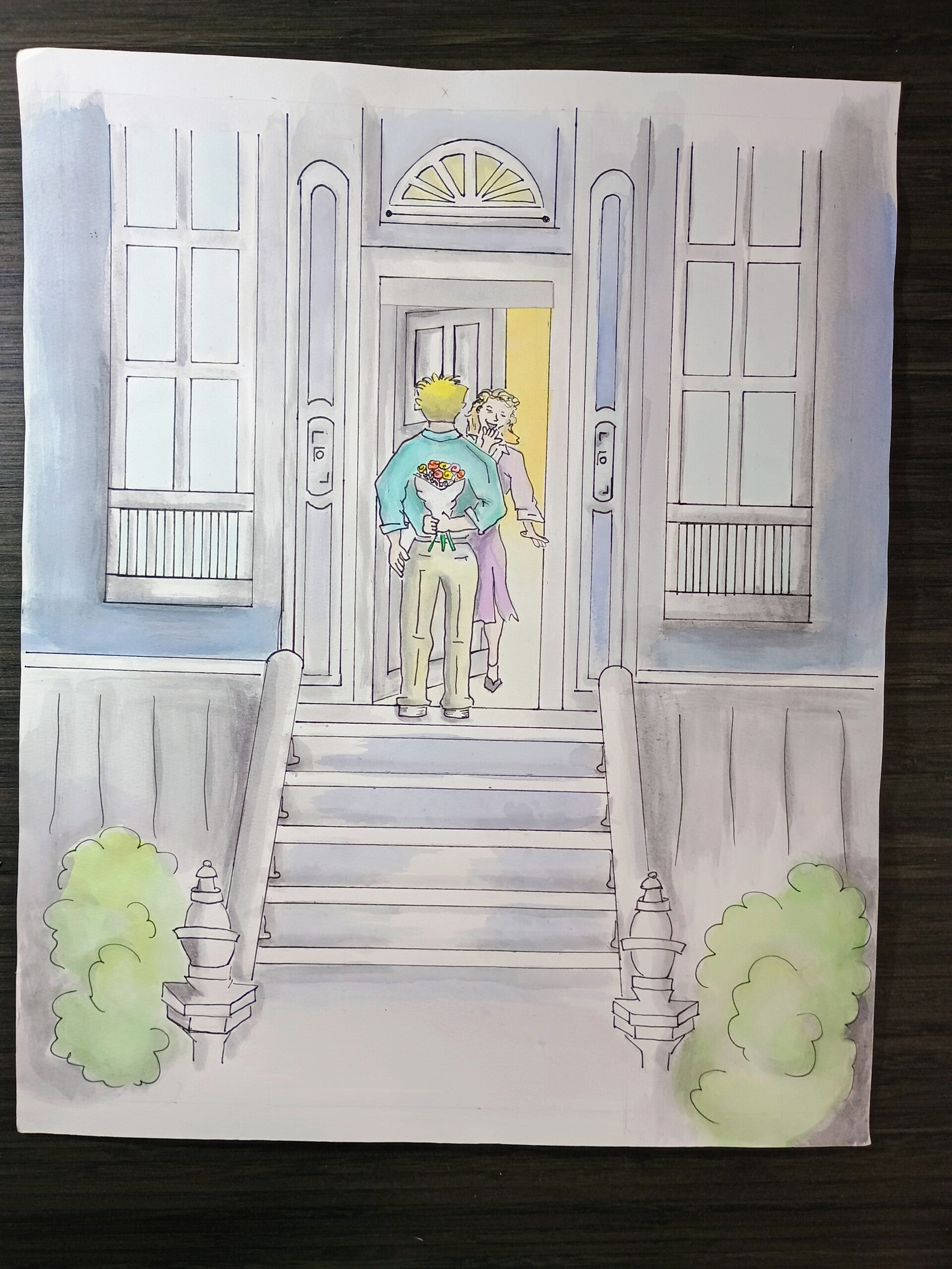
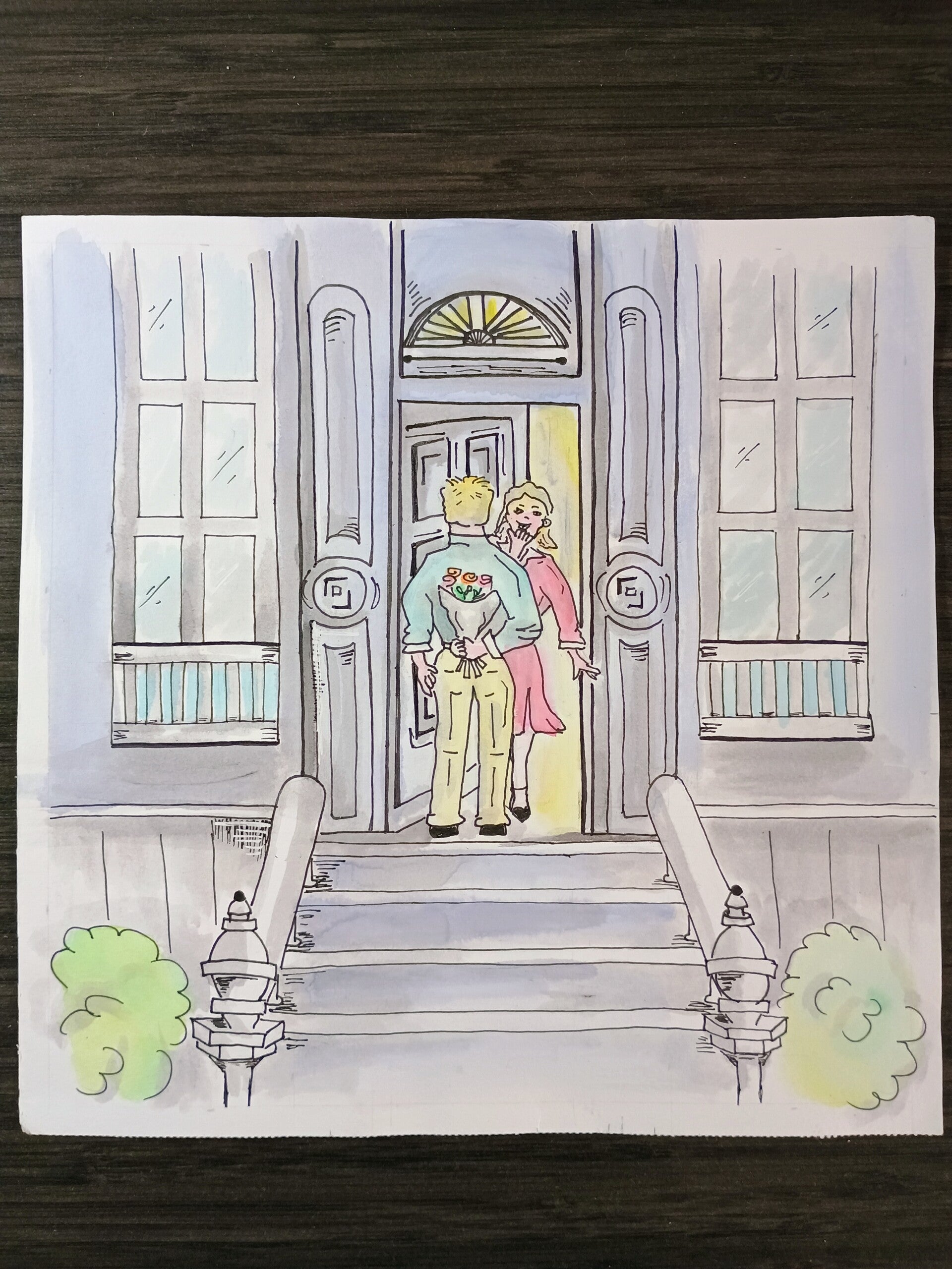
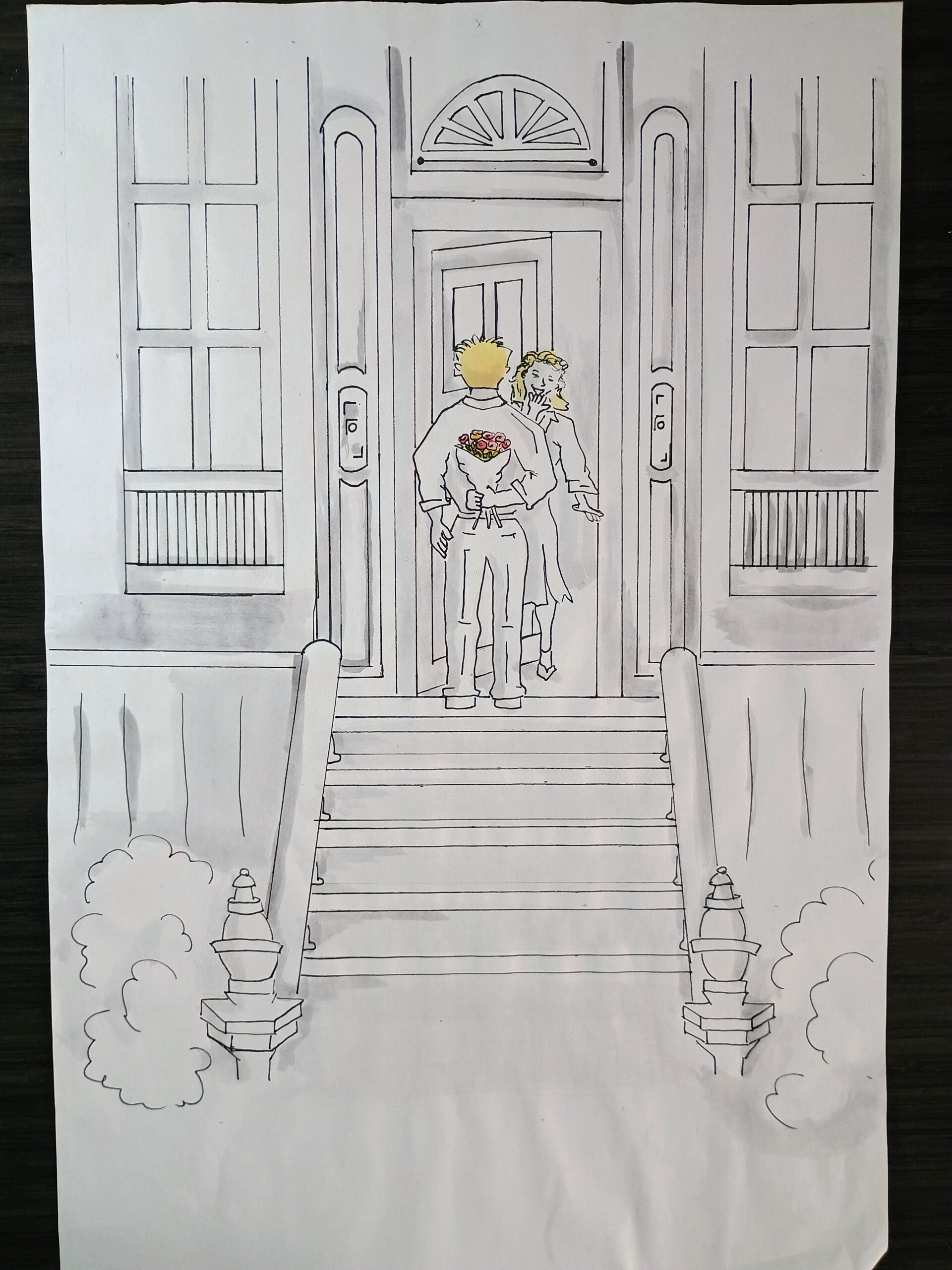
The process involved multiple iterations to get the composition just right. With the first six versions, challenges arose such as perspective issues, excessive hatch marks, and shadows that did not read correctly. To approach the work with a fresh perspective, a break was taken to create a still-life illustration using the same technique in a simpler scene. During this process, copies of the illustration were xeroxed so the India ink washes and watercolor could be experimented with freely. Having a copy of the outlined illustration allowed for testing of tones and colors without affecting the original work. They also are useful as coloring pages! The approach of working with a simpler scene and using test pages allowed experimentation without the pressure of the complex narrative scene and helped refine the overall method.
In addition, Steve Reddy was helpful in providing tips, after initially being inspired by his instructional videos. These suggestions gave further insight, with examples of hatch mark placement, shadow intensity, and the gradual layering of ink using his own artwork as examples. Fine-tuning the process helped achieve the final result.
In the last iteration, shadows were applied lightly with a minimum of hatch marks, gradually building the image. Because India ink cannot be erased easily, details were added progressively rather than all at once, making careful layering essential. The resulting illustration captured the essence of the scene while reflecting the lessons learned through all previous attempts, balancing composition, shading, and color in a cohesive and visually engaging way.
Date has been an ongoing project throughout the course of this year. This final version was selected for display during the Young Frankenstein play at The Lewisville Playhouse and added to the Traditions Collection, alongside other works exploring timeless themes through ink and watercolor.
Inspiration & Meaning
Date reflects both a reverence for traditional courtship and the evolving dynamics of modern relationships. The gesture of flowers at the door evokes a time when romance was formal and ceremonious, now juxtaposed against a culture of casual dating and unconventional arrangements. Beneath the polished surface of the scene lies the unpredictable nature of intimacy—whether a connection blossoms into love or turns into a “Frankenstein moment.”
See the Rich Tradition Collection
See theDate